
Data Visualisation for Social Good
A bit of back story
Melbourne has now been in lockdown (non-consecutively) for over 230 days since last year, at the point of me writing this. I have gone through all the things: getting really into baking, discovered new areas in my 5km radius, zoom trivia nights, watching all of Netflix, drinking all the wine, got my hands on a PS5 and played all the games, some of them twice. I am fortunate not to have to take care of children, so I have a very different experience than people who struggle with home school. My biggest complaint is how to deal with the boredom of being stuck at home alone this long.
We are all going through micro crises, and no one should be expected to do anything in this strange time, but I finally hit a wall around day 210. I hit a point where if I didn’t start focusing on something new, I would crack. So I decided I wanted to be better at data visualisation. I love seeing how people tell stories with data. See https://informationisbeautiful.net/.
To start, I did an online course: Data Visualization and Information Design: Create a Visual Model through Domestika. Usually, when. I am making graphs for a report in Data Studio that updates with new data each week and has a very functional purpose. It was interesting to look at what could be done if your data is static. One of the best tools I found from the course was: https://app.rawgraphs.io/. This tool allows you to make charts and graphs that can be exported in eps format, then bring them into Illustrator to colour and add to while knowing that the data is accurate.
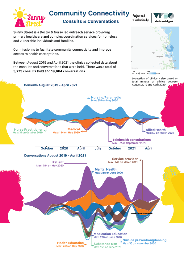
With my newfound skills, I signed up to data viz for social good. Below is my attempt infographic to help out a great organisation, Sunny Street.
Community Connectivity
Reading through the information on Sunny Street, it became clear that their incredible service was unpinned by given the homeless and vulnerable a place to speak and be heard. This is why I wanted to show all the myriad of different consults and conversations over time.
For example, in one month, they were able to help 155 people with substance abuse, and in the same month, 355 with mental health issues.
The data was sourced by Sunny Steet’s Volaby system and provided by Vis by Social Good.
This is just the start and I would love to do more, especially for good causes. Any constructive feedback would be appreciated. I have always been more of a numbers person than an artist so it has been enjoyable exploring that side of my brain.